


Why Your Resume Gets Rejected Before a Human Sees It
Applicant tracking systems parse your file first. Size, layout, and scans are why it fails.

28 July 2026
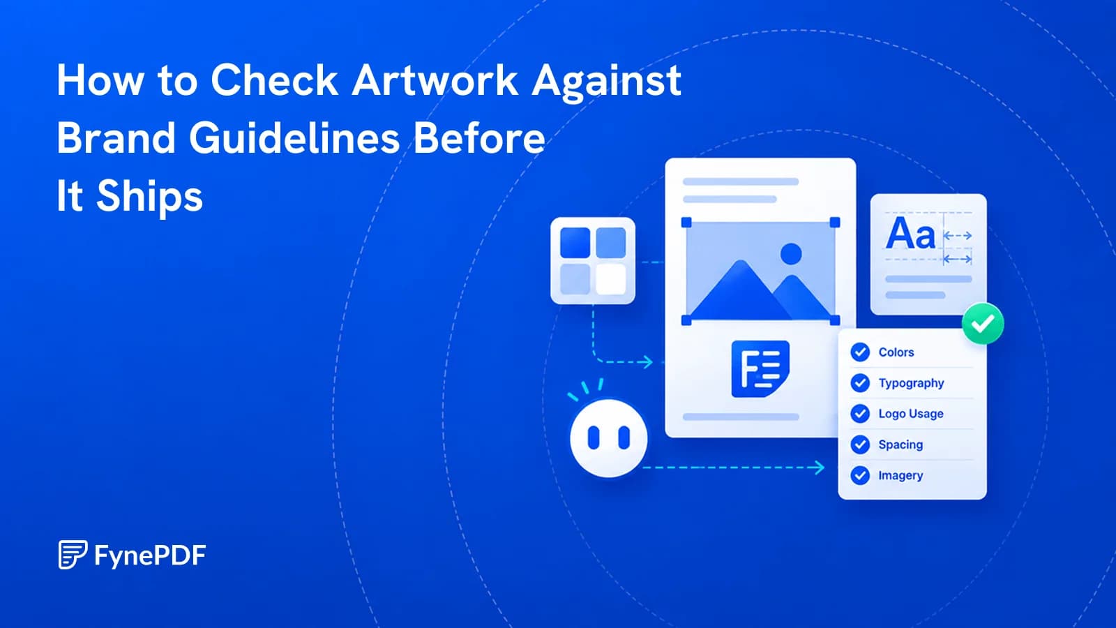
Wrong logo variant, near-miss colour, substituted font. These get artwork sent back.
Most brand compliance failures are small and repetitive: a logo variant used on the wrong background, a colour that is close to the brand value but not it, a font substituted when the file moved between machines. Checking artwork against the guidelines before it ships catches these while they are cheap to fix.
The mechanical checks are the ones worth automating. Whether the work is on brand in spirit is a judgement your brand team makes.
Wrong logo variant. Most identities specify a version for light backgrounds, one for dark, a mono version, and minimum clear space. Using the full-colour logo on a dark photograph is the classic.
Near-miss colours. A brand blue reproduced from memory, sampled from a screenshot, or converted between colour spaces without correction. Visually close, measurably wrong, and inconsistent across a campaign.
Substituted fonts. A file opened on a machine without the licensed typeface renders in a default, and the substitution is often subtle enough to survive review.
Clear space violations. Text or imagery crowding the logo, which most guidelines specify precisely.
Logo distortion. Scaled non-proportionally, recoloured, or placed on a busy background.
Inconsistent terminology. Product names capitalised differently across a single document.
Free accounts get 10 interactions and files up to 15MB. If your artwork is a large print-resolution export, Compress PDF will bring it under for checking, though you should always fix and re-export from the original.
The pattern is work produced outside the team that owns the brand:
Internal design teams with the correct assets installed make these errors less often. Everyone else makes them constantly, and usually without realising.
| Checkable | Needs your brand team |
|---|---|
| Colour values against the palette | Whether the composition works |
| Fonts present and correctly used | Whether the tone is right |
| Logo variant and proportions | Whether imagery suits the brand |
| Clear space around the logo | Whether messaging is on strategy |
| Terminology consistency | Whether it should ship at all |
The value is clearing the mechanical layer so review conversations are about the work rather than about a hex value. A reviewer who spends their attention spotting a wrong blue has less left for whether the concept is any good.
Because colour spaces differ and conversion is lossy. A brand colour defined for print will not have an identical screen equivalent, and converting between them without a defined value for each produces a different result every time.
Guidelines that specify values for each context prevent this. Where they only give one value, the drift is inevitable and each new asset compounds it.
Note that a document converted to grayscale for printing removes brand colour entirely, which is expected rather than a compliance failure.
Upload them alongside the artwork so the check has something to compare against. Without them it can only flag internal inconsistency, such as the same product name capitalised two ways.
It reviews the document as supplied. Print production also involves bleed, trim, and colour profile requirements, which are a separate conversation with your printer.
Before. It removes the mechanical errors so reviewers can focus on the work itself.
Files transfer over encrypted connections and are permanently deleted within 15 minutes of processing unless you save them to your library.
Upload it to the Brand Guideline Checker with your guidelines, and fix what it finds in the source file.
Try it yourself
Applicant tracking systems parse your file first. Size, layout, and scans are why it fails.
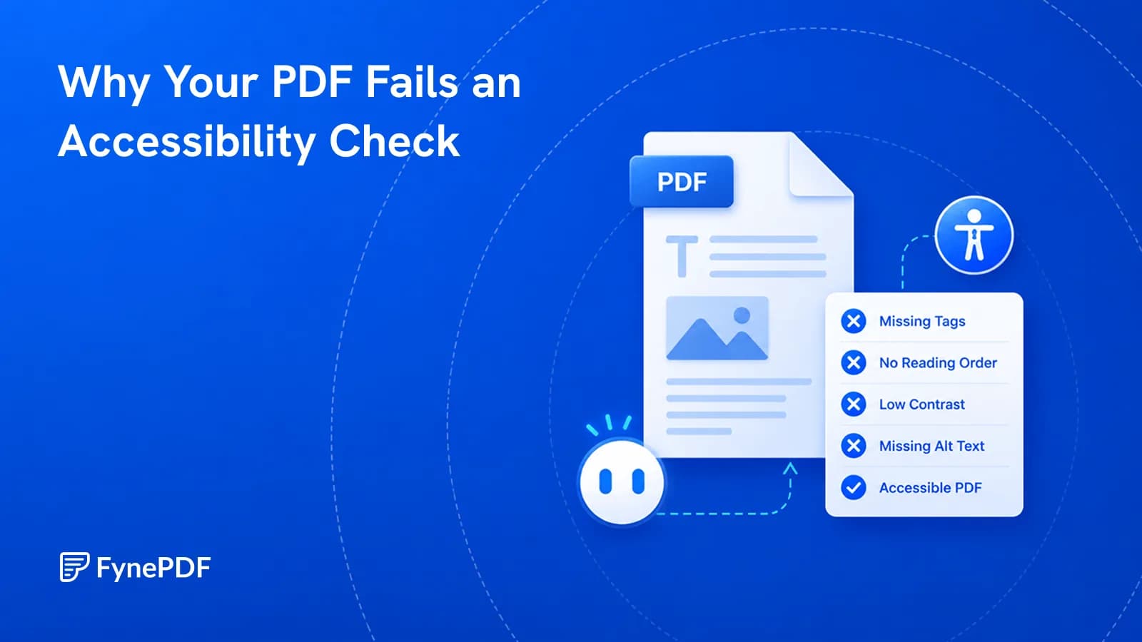
A PDF that looks fine can be unreadable with a screen reader. Here's what's missing.
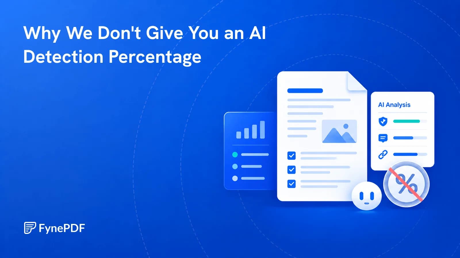
Percentages get treated as proof and used against people. We tell you what we found instead.